
I'm spraying the fourth one on my ATC
| Project September 6, 2015 << < 1 2 3 4 > >> |
 DovahKiinZaan September 8, 2015 |
I'm spraying the fourth one on my ATC |
by DovahKiinZaan
September 8, 2015

|
Denisowator September 8, 2015 |
Definitly the 4th one. Although in my opinion, it would be way better if the circle was a little big smaller, so that the dragon head's horns went outside of it, and were white to be visible and create even more contrast.
But that's just my opinion, I can imagine a lot of people not liking that idea. Especially since I've seen many images where the image changes from black to white to be visible, and it can be painful to look at sometimes. Both mentally and physically. |
by Denisowator
September 8, 2015
Definitly the 4th one. Although in my opinion, it would be way better if the circle was a little big smaller, so that the dragon head's horns went outside of it, and were white to be visible and create even more contrast.
But that's just my opinion, I can imagine a lot of people not liking that idea. Especially since I've seen many images where the image changes from black to white to be visible, and it can be painful to look at sometimes. Both mentally and physically.
 Frinmulaar September 8, 2015 |
I liked the double-triangular mountaintop the most in the flag thread, but I understand why paarthurnax wouldn't want it in his own contest. Out of these, my vote goes to number four. #1 lacks clearly defined proportions, dragons don't use axes, and #3 looks somewhat too "naval" for want of a better word. |
by Frinmulaar
September 8, 2015
I liked the double-triangular mountaintop the most in the flag thread, but I understand why paarthurnax wouldn't want it in his own contest. Out of these, my vote goes to number four. #1 lacks clearly defined proportions, dragons don't use axes, and #3 looks somewhat too "naval" for want of a better word.
|
Xatarias September 8, 2015 |
The fourth one's my choice as well. All of them look amazing, though. |
by Xatarias
September 8, 2015
The fourth one's my choice as well. All of them look amazing, though.
 Orkar Isber September 8, 2015 |
could someone make a simplofoed version of #4? like a dragon head with less details? |
by Orkar Isber
September 8, 2015
could someone make a simplofoed version of #4? like a dragon head with less details?
 paarthurnax Administrator September 8, 2015 |
Orkar Isber As a matter of fact, the artist of #4 also provided a simplified version with their submission. I decided to post the more detailed version but I will share the alternate when I have the chance. |
by paarthurnax
September 8, 2015
Orkar Isbercould someone make a simplofoed version of #4? like a dragon head with less details?
As a matter of fact, the artist of #4 also provided a simplified version with their submission. I decided to post the more detailed version but I will share the alternate when I have the chance.
 Sahkrahfaas September 8, 2015 |
I think #4 represents the language best (because it's got the dragon's head), so my vote goes to that one. I like #2 as well, though, I thought that one was clever :) |
by Sahkrahfaas
September 8, 2015
I think #4 represents the language best (because it's got the dragon's head), so my vote goes to that one. I like #2 as well, though, I thought that one was clever :)
 Shadowcaster September 8, 2015 |
Fourth is nice, but when I think of a flag, I think number three. It's simple, direct and elegant. It is a flag that is easy to make and share. "What's your flag?" "Oh, my flag is awesome! It has this and this and A dragons head biting a dovahzul letter..." "My flag is red white and blue with stars and stripes." If I wanted to make a flag myself and raise it on high, number three would be the first one I would go for. Sure, the dragons head is awesome, but there is something to be said for directness. |
by Shadowcaster
September 8, 2015
Fourth is nice, but when I think of a flag, I think number three. It's simple, direct and elegant.
It is a flag that is easy to make and share. "What's your flag?" "Oh, my flag is awesome! It has this and this and A dragons head biting a dovahzul letter..."
"My flag is red white and blue with stars and stripes."
If I wanted to make a flag myself and raise it on high, number three would be the first one I would go for.
Sure, the dragons head is awesome, but there is something to be said for directness.
|
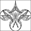
paarthurnax Administrator September 8, 2015 |
Here is the simplified version:
I have some thoughts on how to simplify it further, but that would perhaps not be in the spirit of the contest. For now, choose from the 4 above, and then we can decide what to do with the final design. |
by paarthurnax
September 8, 2015
Here is the simplified version:

I have some thoughts on how to simplify it further, but that would perhaps not be in the spirit of the contest. For now, choose from the 4 above, and then we can decide what to do with the final design.
|
Denisowator September 8, 2015 |
paarthurnax I think if it were to be simplyfied any more, it would end up looking like a pig's head. xD |
by Denisowator
September 8, 2015
paarthurnaxHere is the simplified version:
I have some thoughts on how to simplify it further, but that would perhaps not be in the spirit of the contest. For now, choose from the 4 above, and then we can decide what to do with the final design.
I think if it were to be simplyfied any more, it would end up looking like a pig's head. xD
 Ahbiilok September 9, 2015 |
Play Pretend Only people who joined before sept. 6 are elegible to vote. |
by Ahbiilok
September 9, 2015
Play PretendI am a new member but I like the 4th for sure!
Only people who joined before sept. 6 are elegible to vote.
|
Orkar Isber September 9, 2015 |
Ok now i did vote for #4 - the simplified version looks fine to me - maybe have the face more triangular like in #4 One more thing maybe we could change the colors - black and white looks awesome but it has nothing to do with Dovahzul - maybe we change it to blue red? Sky blue above and red deep within? or blue black? Or maybe blue white for the snow? I guess if we play with the colors it wont look like eye cancer ^^
Also the smaller it gets the harder its to recognise - simple flags can actually still be seen in 16x16 but it may be of importance for websites - tabs and such but i think they are 32x32 as well now |
by Orkar Isber
September 9, 2015
Ok now i did vote for #4 - the simplified version looks fine to me - maybe have the face more triangular like in #4
One more thing maybe we could change the colors - black and white looks awesome but it has nothing to do with Dovahzul - maybe we change it to blue red? Sky blue above and red deep within? or blue black? Or maybe blue white for the snow? I guess if we play with the colors it wont look like eye cancer ^^
Also the smaller it gets the harder its to recognise - simple flags can actually still be seen in 16x16 but it may be of importance for websites - tabs and such but i think they are 32x32 as well now
|
paarthurnax Administrator September 9, 2015 |
I actually like black and white best, since it's easiest to use in print material and matches Skyrim's box art and promotional material. |
by paarthurnax
September 9, 2015
I actually like black and white best, since it's easiest to use in print material and matches Skyrim's box art and promotional material.
 RadioactiveYeti September 9, 2015 |
either 2nd or 4th one.
in my opinion, 4th one is the best. |
by RadioactiveYeti
September 9, 2015
either 2nd or 4th one.
in my opinion, 4th one is the best.